Ledgerline
A design system and component library for a co-operative bookkeeping tool.
- Client
- Acme Co-operative
- Role
- Design system lead and React component engineering
- Team
- With three product developers
- Year
- 2025 · Six months, part-time
Overview
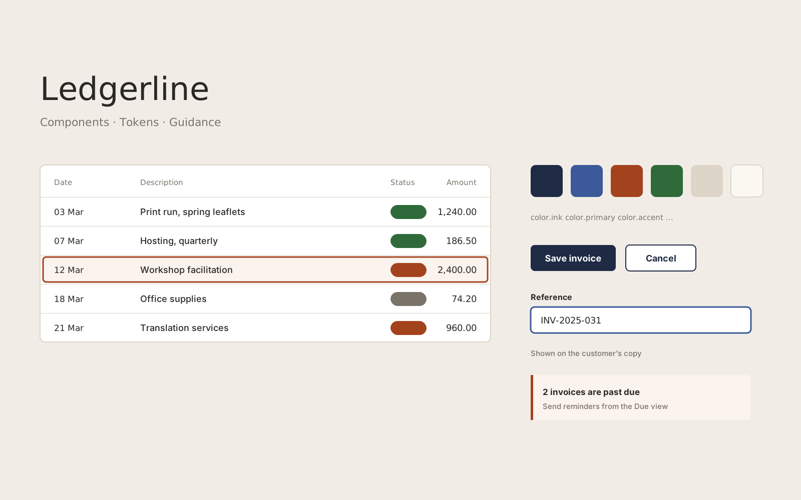
A small co-operative had grown a bookkeeping tool over several years. Each screen had been designed in isolation, so tables, forms and buttons behaved differently from page to page. Ledgerline gave the team a shared vocabulary and a set of accessible components they could adopt gradually.
The problem
The product had four kinds of data table and three date pickers. Keyboard users could not complete several common tasks, and every new feature started with someone rebuilding a component from scratch.
The team was small and already busy, so a big-bang redesign was not an option.
Approach
I began with an inventory of every component in production, grouped by purpose rather than appearance. That made the duplication visible and gave the team an agreed order for replacing things.
- Design tokens for colour, spacing, type and radius, shared between Figma and CSS custom properties.
- A focused set of components — buttons, fields, tables, dialogs and notices — each with keyboard and screen reader behaviour documented next to the code.
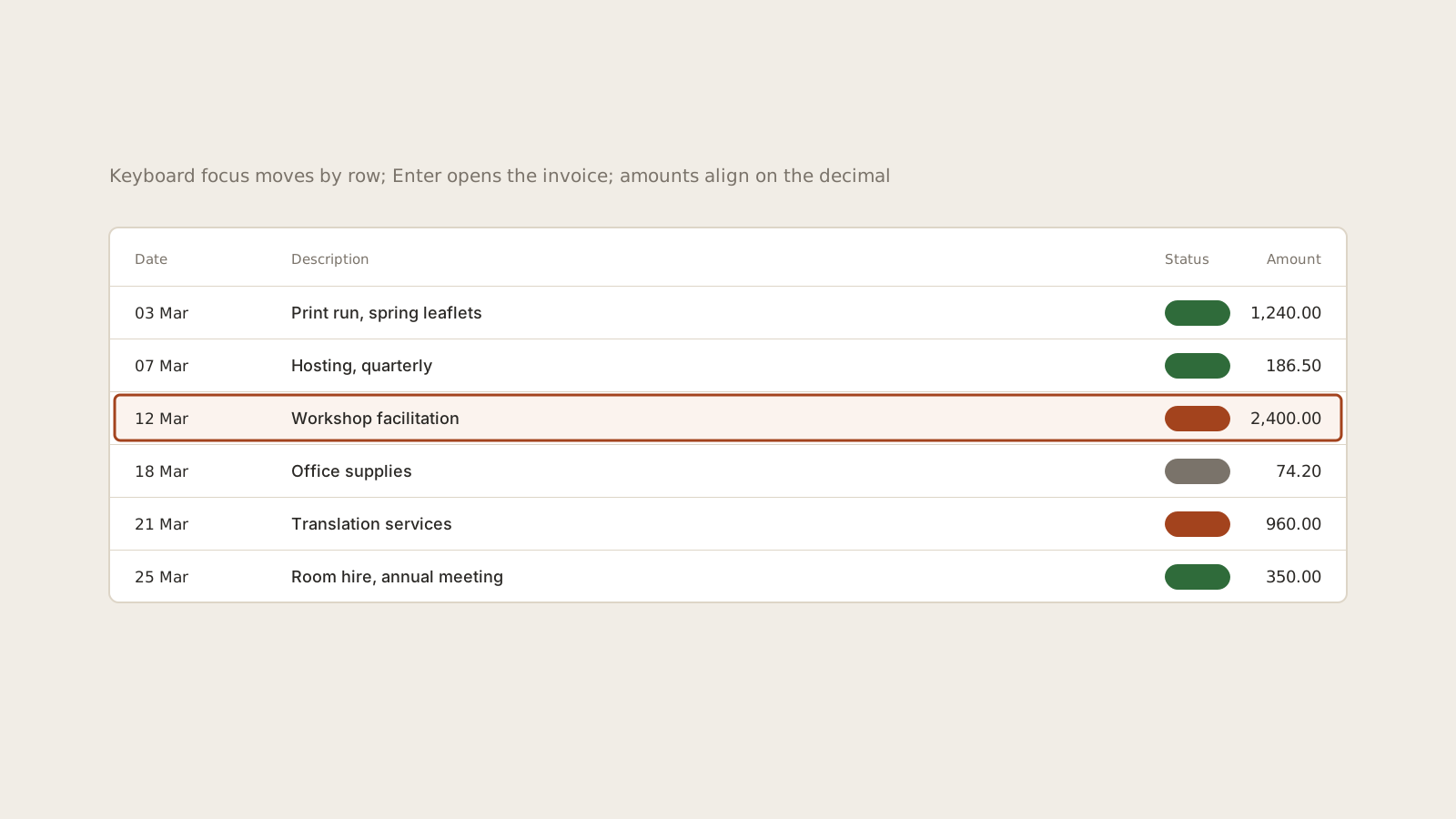
- Tabular figures and right-aligned amounts throughout, because the product is mostly numbers.
- A migration guide so each team could replace old components screen by screen.
Result
New screens are now assembled from the library, and the documentation site is the first place the team looks when building a feature. Keyboard support for the main invoicing and reconciliation flows was tested with the co-operative’s members, including a screen reader user.
What I learned
- An honest inventory persuaded people more effectively than any mock-up.
- Documenting behaviour, not only appearance, is what made components reusable.
- Gradual migration was slower but kept the product shippable throughout.